Truephonics.
Truephonics.
WEBSITE & DASHBOARD
WEBSITE & DASHBOARD
TruePhonics is a phonics learning app for children aged 3-8+, built for kids with dyslexia, ADHD, and reading difficulties. I was brought in as a freelance Product Designer to design the marketing website and a B2B dashboard from scratch, with no existing design system and no prior design work to reference.
TruePhonics is a phonics learning app for children aged 3-8+, built for kids with dyslexia, ADHD, and reading difficulties. I was brought in as a freelance Product Designer to design the marketing website and a B2B dashboard from scratch, with no existing design system and no prior design work to reference.
The dashboard serves 6 user roles: Super Admin, Admin, Distributor, Organization, Teacher, and Parent. Each with different permissions, different data, and different needs. I designed every flow, every screen, and made all data visualization decisions independently based on a PRD provided by the client.
The dashboard serves 6 user roles: Super Admin, Admin, Distributor, Organization, Teacher, and Parent. Each with different permissions, different data, and different needs. I designed every flow, every screen, and made all data visualization decisions independently based on a PRD provided by the client.
Timeline
Timeline
3 Weeks
3 Weeks
Role
Role
Product Desigenr
Product Desigenr
Skills
Skills
Product Design, Website Design, B2B
Product Design, Website Design, B2B
BACKGROUND
BACKGROUND
TruePhonics teaches reading through a game, using the Orton-Gillingham method and the Science of Reading. It's built for kids who struggle with traditional phonics, and it was backed by a 2023 Queen's University study.
TruePhonics teaches reading through a game, using the Orton-Gillingham method and the Science of Reading. It's built for kids who struggle with traditional phonics, and it was backed by a 2023 Queen's University study.

When I joined, there was nothing on the design side. The only thing that existed was the game app, and it had a completely separate look because it's, well, a game for children. I had to design a website and a dashboard that felt connected to that game but also worked for schools and parents.
When I joined, there was nothing on the design side. The only thing that existed was the game app, and it had a completely separate look because it's, well, a game for children. I had to design a website and a dashboard that felt connected to that game but also worked for schools and parents.
So most of the job was figuring out a shared design language. The website sits between the playful game and the cleaner BGC brand. The dashboard leans more corporate, since it's a tool people use for work, but still carries some of the product's warmth.
So most of the job was figuring out a shared design language. The website sits between the playful game and the cleaner BGC brand. The dashboard leans more corporate, since it's a tool people use for work, but still carries some of the product's warmth.
PROBLEM AND CONTEXT
The app had just launched and schools weren't tracking progress at all. There was no dashboard yet. I was building it from zero. The data wasn't the tricky bit. The roles were. Six of them, each with their own permissions and their own version of the dashboard:
The app had just launched and schools weren't tracking progress at all. There was no dashboard yet. I was building it from zero. The data wasn't the tricky bit. The roles were. Six of them, each with their own permissions and their own version of the dashboard:
Super Admin
Admin
Distributer
Organization
Teacher
Parent
A super admin looking at business metrics and a parent checking if their kid did their lessons want completely different things. So every screen had to be designed with all six in mind, even when only one of them would ever see it. And none of the products talked to each other visually. The game, the site, the dashboard. all separate. A big part of the work was just making them feel like one thing.
A super admin looking at business metrics and a parent checking if their kid did their lessons want completely different things. So every screen had to be designed with all six in mind, even when only one of them would ever see it. And none of the products talked to each other visually. The game, the site, the dashboard. all separate. A big part of the work was just making them feel like one thing.
PROCESS
PROCESS
It started with one meeting. The founder explained the product, the data they had, and who'd be using it. The brief was basically: make it simple enough that anyone can pick it up.
It started with one meeting. The founder explained the product, the data they had, and who'd be using it. The brief was basically: make it simple enough that anyone can pick it up.
I designed the website first. It was the fastest way to lock the visual language. type, color, tone. before getting into the harder dashboard work. Once that was set, the dashboard had something to build on. I worked off the PRD but had room to make my own calls. The doc said what to show. I decided how. which charts, which components, how to lay it out for each role without burying anyone in data they didn't need.
I designed the website first. It was the fastest way to lock the visual language. type, color, tone. before getting into the harder dashboard work. Once that was set, the dashboard had something to build on. I worked off the PRD but had room to make my own calls. The doc said what to show. I decided how. which charts, which components, how to lay it out for each role without burying anyone in data they didn't need.
Feedback came from the founder and a few board reviews. Nothing got scrapped. The direction held the whole way through.
Feedback came from the founder and a few board reviews. Nothing got scrapped. The direction held the whole way through.
THE WEBSITE
THE WEBSITE
The balance was the whole point. BGC brought the colors and the clean, institutional feel. The game brought the characters and the playful bits parents and kids would recognize. Together it read as TruePhonics, not just a corporate site.
The balance was the whole point. BGC brought the colors and the clean, institutional feel. The game brought the characters and the playful bits parents and kids would recognize. Together it read as TruePhonics, not just a corporate site.
I built all the components from scratch. I'd wanted to do more with motion. one idea was a little boat sailing along the learning-path map to show how a kid moves through the curriculum. There wasn't dev bandwidth for it, so the map stayed static. Still happy with how the layout came out.
I built all the components from scratch. I'd wanted to do more with motion. one idea was a little boat sailing along the learning-path map to show how a kid moves through the curriculum. There wasn't dev bandwidth for it, so the map stayed static. Still happy with how the layout came out.
They gave me the copy, I gave it a structure and a look.
They gave me the copy, I gave it a structure and a look.


THE DASBOARD
THE DASBOARD
Same design language across all four flows I designed. Same components, different data and permissions depending on who's looking.
Same design language across all four flows I designed. Same components, different data and permissions depending on who's looking.
ADMIN/DISTRIBUTOR FLOW
ADMIN/DISTRIBUTOR FLOW
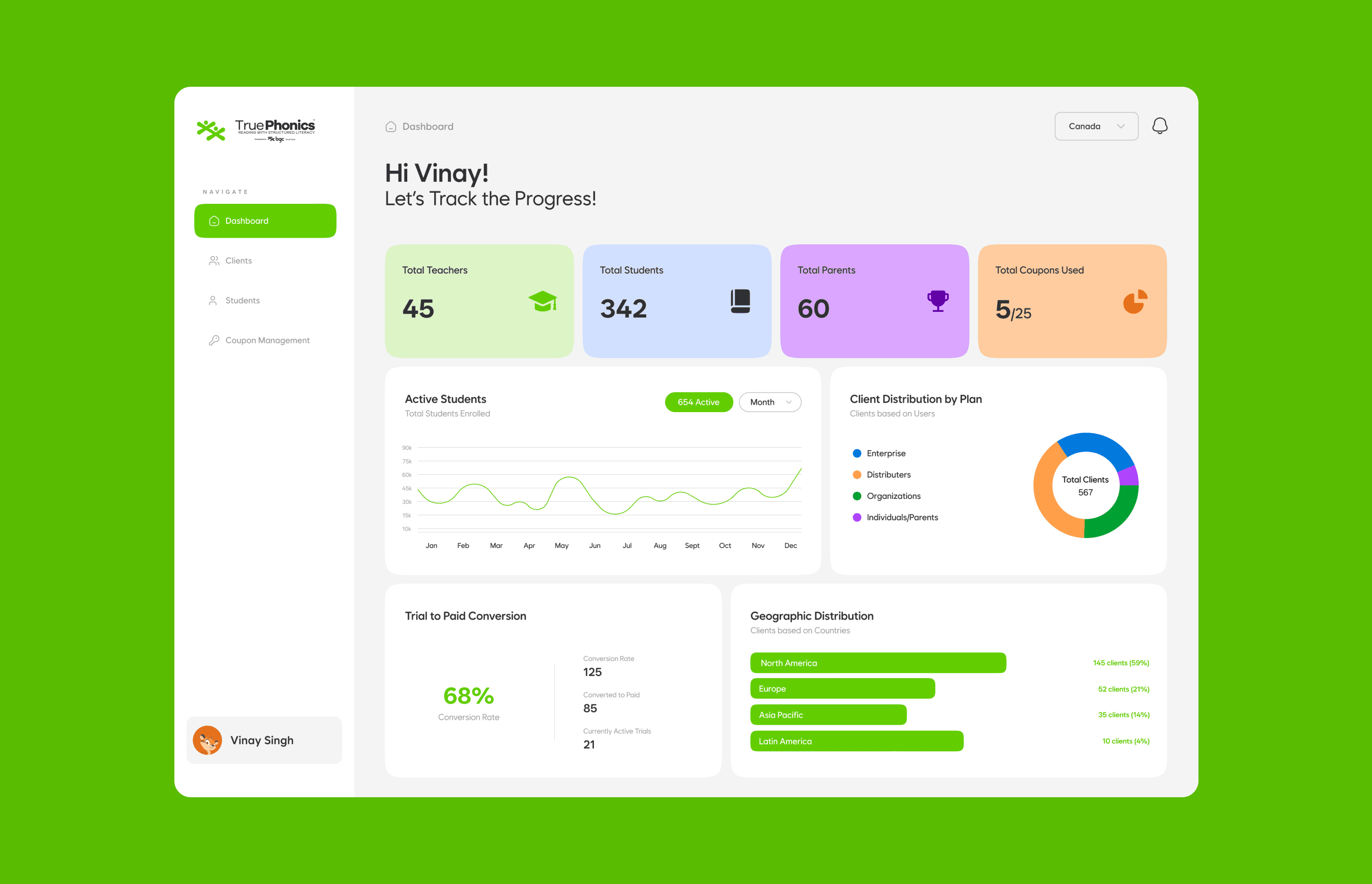
This is the business view. Five color-coded cards up top show how many Admins, Distributor Admins, Organizations, Teachers, and Parents are on the platform.
This is the business view. Five color-coded cards up top show how many Admins, Distributor Admins, Organizations, Teachers, and Parents are on the platform.
Underneath, four charts tell the rest of the story: Active Students over time, Client Distribution by plan, Trial-to-Paid conversion, and Geographic Distribution by region. Each one uses the chart that actually fits the data, not just whatever looked nice.
Underneath, four charts tell the rest of the story: Active Students over time, Client Distribution by plan, Trial-to-Paid conversion, and Geographic Distribution by region. Each one uses the chart that actually fits the data, not just whatever looked nice.

Clients Management is the full roster. search, sort, filter, with role badges so you can tell who's who at a glance.
Clients Management is the full roster. search, sort, filter, with role badges so you can tell who's who at a glance.

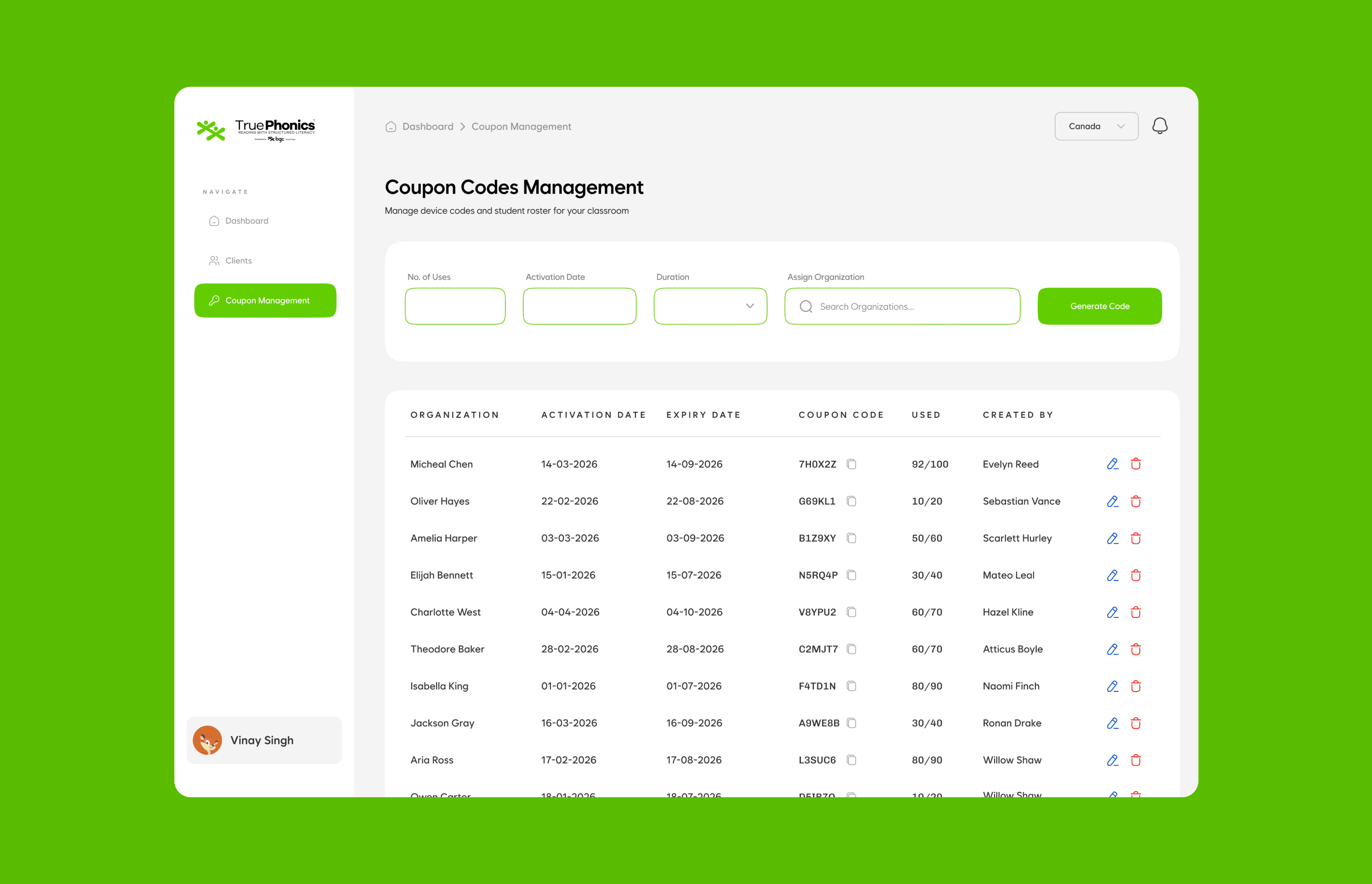
Coupon Management was the fiddliest screen. Admins generate codes by setting the number of uses, activation date, and duration, then assign them to an organization. Everything generated gets tracked in a table: usage, expiry, who made it.
Coupon Management was the fiddliest screen. Admins generate codes by setting the number of uses, activation date, and duration, then assign them to an organization. Everything generated gets tracked in a table: usage, expiry, who made it.
ORGANIZATION FLOW
ORGANIZATION FLOW
The organization is the school. it sits above teachers and below the distributor.
The organization is the school. it sits above teachers and below the distributor.
Their Clients view shows everyone under them, Teachers and Parents, plus two columns the other roles don't get: Coupons Assigned and Total Uses. They need to see how their pool of codes is actually being spent.
Their Clients view shows everyone under them, Teachers and Parents, plus two columns the other roles don't get: Coupons Assigned and Total Uses. They need to see how their pool of codes is actually being spent.

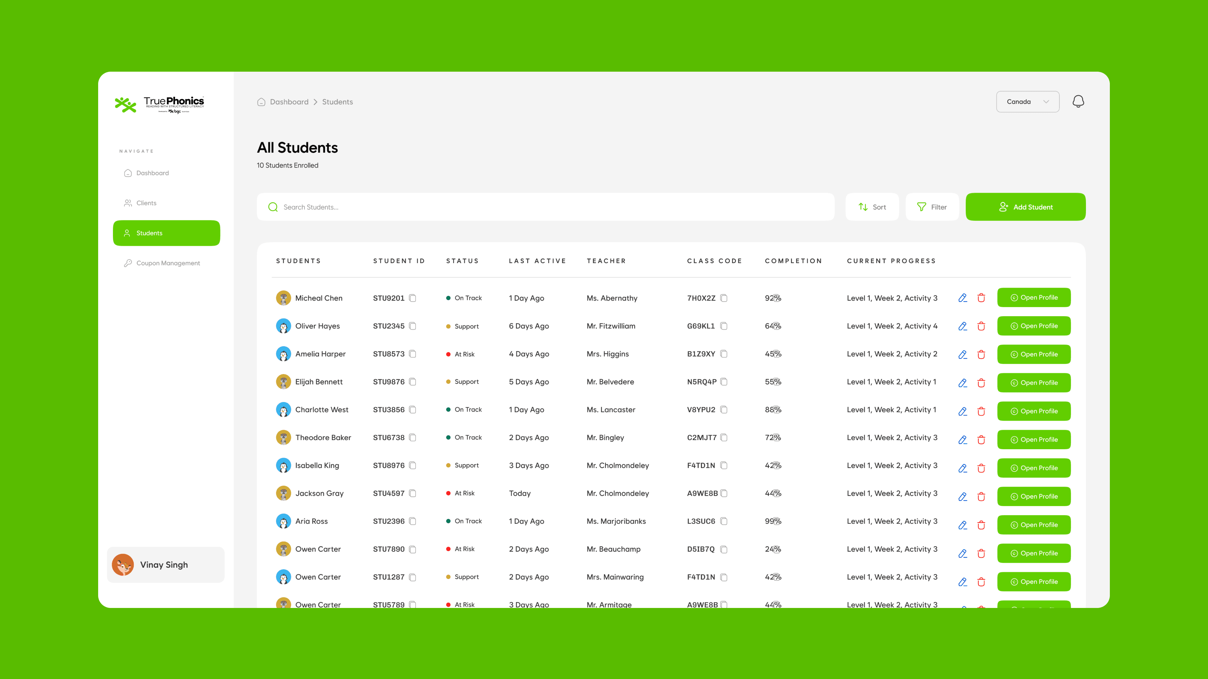
All Students is the school-wide roster, with a Teacher column and Class Code added so an admin can see who's responsible for each kid.
All Students is the school-wide roster, with a Teacher column and Class Code added so an admin can see who's responsible for each kid.
Coupon Management here works differently from the admin's. Orgs don't generate codes, they receive a batch and hand them down to teachers.
Coupon Management here works differently from the admin's. Orgs don't generate codes, they receive a batch and hand them down to teachers.

TEACHER FLOW
TEACHER FLOW
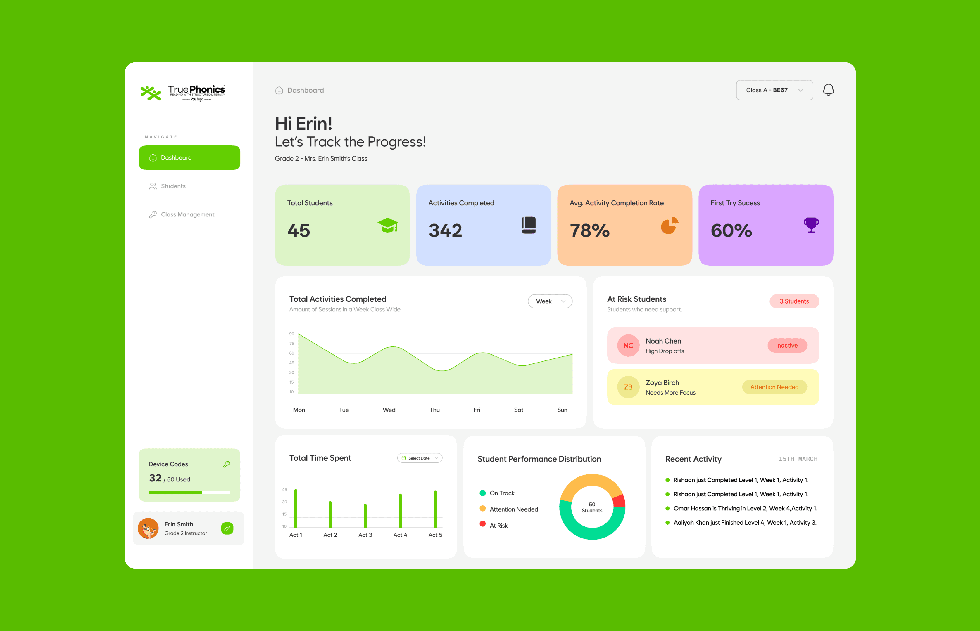
This is where the product gets deep. The teacher sees the classroom. The dashboard opens on class health: Total Students, Activities Completed, Completion Rate, First-Try Success. Two things make it useful day to day. an At Risk Students panel that flags kids who need help right on the home screen, and a Performance Distribution donut that splits the class into On Track, Needs Attention, and At Risk. You open it and you know who to worry about.
This is where the product gets deep. The teacher sees the classroom. The dashboard opens on class health: Total Students, Activities Completed, Completion Rate, First-Try Success. Two things make it useful day to day. an At Risk Students panel that flags kids who need help right on the home screen, and a Performance Distribution donut that splits the class into On Track, Needs Attention, and At Risk. You open it and you know who to worry about.
A class switcher stays pinned top-right so teachers with multiple classes never lose their place.
A class switcher stays pinned top-right so teachers with multiple classes never lose their place.
All Students is the roster with status, completion, and where each kid is in the curriculum (Level, Week, Activity).
All Students is the roster with status, completion, and where each kid is in the curriculum (Level, Week, Activity).

Student Details goes the deepest. Each kid has a profile with their grade, join date, last active, device code, plus buttons to email the parents or download a PDF report. Four cards cover the high-level numbers.
Student Details goes the deepest. Each kid has a profile with their grade, join date, last active, device code, plus buttons to email the parents or download a PDF report. Four cards cover the high-level numbers.
Detailed View Per Activity. The curriculum is huge. 5 levels, 7 weeks each, 5 activities a week, all tracked. Instead of making teachers jump between screens to compare activities, I built one panel that updates in place. You drill from Level to Lesson to Activity and only that panel changes. For a letter-tracing activity it shows session length, whether the kid traced without the outline, time to trace, repeat taps, rewrites, total time. That's not just progress, it's where and how a kid is struggling.
Detailed View Per Activity. The curriculum is huge. 5 levels, 7 weeks each, 5 activities a week, all tracked. Instead of making teachers jump between screens to compare activities, I built one panel that updates in place. You drill from Level to Lesson to Activity and only that panel changes. For a letter-tracing activity it shows session length, whether the kid traced without the outline, time to trace, repeat taps, rewrites, total time. That's not just progress, it's where and how a kid is struggling.

Class Management covers the codes: total, assigned vs. available, the class code to copy, and who's activated theirs. One click pulls a class progress report.
Class Management covers the codes: total, assigned vs. available, the class code to copy, and who's activated theirs. One click pulls a class progress report.

PARENTS FLOW
PARENTS FLOW
Same bones as the teacher view, very different feeling. A teacher manages a class. A parent just wants to know how their kid is doing. The cards shift to match: Subscription Renewal, Activities Completed, Completion Rate, First-Try Success. The subscription counter is parent-only, a quiet reminder without nagging.
Same bones as the teacher view, very different feeling. A teacher manages a class. A parent just wants to know how their kid is doing. The cards shift to match: Subscription Renewal, Activities Completed, Completion Rate, First-Try Success. The subscription counter is parent-only, a quiet reminder without nagging.
Two components make it feel like a consumer app. Learning Streak, a calendar with a streak count, straight out of the Duolingo playbook, and Skills Mastery, a simple bar breakdown of Letter Recognition, Sound Blending, Word Reading, and Sentence Reading. Most parents don't think in levels and activity numbers, so this puts it in plain terms.
Two components make it feel like a consumer app. Learning Streak, a calendar with a streak count, straight out of the Duolingo playbook, and Skills Mastery, a simple bar breakdown of Letter Recognition, Sound Blending, Word Reading, and Sentence Reading. Most parents don't think in levels and activity numbers, so this puts it in plain terms.
⚠ This flow is the one still being refined, since it's the one facing actual customers.
⚠ This flow is the one still being refined, since it's the one facing actual customers.

All Students is the roster with status, completion, and where each kid is in the curriculum (Level, Week, Activity).
All Students is the roster with status, completion, and where each kid is in the curriculum (Level, Week, Activity).
Student Details goes the deepest. Each kid has a profile with their grade, join date, last active, device code, plus buttons to email the parents or download a PDF report. Four cards cover the high-level numbers.
Student Details goes the deepest. Each kid has a profile with their grade, join date, last active, device code, plus buttons to email the parents or download a PDF report. Four cards cover the high-level numbers.
Detailed View Per Activity. The curriculum is huge. 5 levels, 7 weeks each, 5 activities a week, all tracked. Instead of making teachers jump between screens to compare activities, I built one panel that updates in place. You drill from Level to Lesson to Activity and only that panel changes. For a letter-tracing activity it shows session length, whether the kid traced without the outline, time to trace, repeat taps, rewrites, total time. That's not just progress, it's where and how a kid is struggling.
Detailed View Per Activity. The curriculum is huge. 5 levels, 7 weeks each, 5 activities a week, all tracked. Instead of making teachers jump between screens to compare activities, I built one panel that updates in place. You drill from Level to Lesson to Activity and only that panel changes. For a letter-tracing activity it shows session length, whether the kid traced without the outline, time to trace, repeat taps, rewrites, total time. That's not just progress, it's where and how a kid is struggling.
Class Management covers the codes: total, assigned vs. available, the class code to copy, and who's activated theirs. One click pulls a class progress report.
Class Management covers the codes: total, assigned vs. available, the class code to copy, and who's activated theirs. One click pulls a class progress report.
DECISIONS I'D CALL OUT
DECISIONS I'D CALL OUT
The in-place activity panel. Given how deep the curriculum goes, separate screens for each activity would've been miserable to navigate. One panel that swaps its contents keeps you in context. Probably the decision I think about most.
The in-place activity panel. Given how deep the curriculum goes, separate screens for each activity would've been miserable to navigate. One panel that swaps its contents keeps you in context. Probably the decision I think about most.
Keeping it playful but trustworthy. It's a B2B tool, but it's about kids. The game maps, the character avatars, the soft palette. they're there to keep the child in view, not just to decorate.
Keeping it playful but trustworthy. It's a B2B tool, but it's about kids. The game maps, the character avatars, the soft palette. they're there to keep the child in view, not just to decorate.
WHAT I'D CHANGE
WHAT I'D CHANGE
I'd redo onboarding first, getting new teachers and admins comfortable with their permissions and codes need more than it got. I'd also build a tighter system for scale. It holds up for there screens but a growing platform needs more underneath. A few calls went the client's way that I'd push back on harder now.
I'd redo onboarding first, getting new teachers and admins comfortable with their permissions and codes need more than it got. I'd also build a tighter system for scale. It holds up for there screens but a growing platform needs more underneath. A few calls went the client's way that I'd push back on harder now.
WHERE IT LANDED
WHERE IT LANDED
Built and in refinement. The team liked it, especially how the information was organized and how much it surfaces without feeling heavy. For something with six roles and this much data, that was the whole challenge
Built and in refinement. The team liked it, especially how the information was organized and how much it surfaces without feeling heavy. For something with six roles and this much data, that was the whole challenge