Supernova Green.
Supernova Green.
EV CHARGER UI/UX
EV CHARGER UI/UX
EV CHARGER UI/UX
Redesigned a public EV charger UI from a technical engineer-facing interface into a consumer-grade product approved for production rollout across Supernova Green's charging network in India.
TL;DR
TL;DR
THE SITUATION
Supernova Green had working EV charger hardware — but the UI felt like a developer debug screen. Not fit for everyday consumers.
Supernova Green had working EV charger hardware — but the UI felt like a developer debug screen. Not fit for everyday consumers.
WHAT I DID
Led a full UI/UX redesign in 3 weeks — audit, user flow mapping, wireframes, design system, and final screens — all in Figma.
Led a full UI/UX redesign in 3 weeks — audit, user flow mapping, wireframes, design system, and final screens — all in Figma.
THE RESULT
A consumer-grade interface with a unified brand identity, approved for production rollout across their charging network in India.
Timeline
3 Weeks
Disciplines
UI/UX Design
Role
Design Lead
Tools
Figma
Timeline
3 Weeks
Role
Design Lead
Disciplines
UI/UX Design
Tools
Figma
OVERVIEW
OVERVIEW
Background.
Background.
Supernova Green, based in Ahmedabad, is scaling from diesel generator manufacturing and automotive dealerships (Kia, Audi, Tata) into sustainable EV charging infrastructure across India. Their charger hardware was ready — but the software experience was far behind.
I was brought in as Design Lead to rebuild the charger UI from the ground up — creating a visual identity that matched their emerging clean-energy brand while making the charging process feel effortless for everyday EV owners.
THE PROBLEM
THE PROBLEM
Built for engineers. Used by everyone.
Built for engineers. Used by everyone.
The previous interface was functional but not designed for consumer use. It felt technical, inconsistent, and confusing to anyone unfamiliar with EV charging protocols. While Analyising the user interface and user experience of the EV charger I listed down 6 major core problems.
The previous interface was functional but not designed for consumer use. It felt technical, inconsistent, and confusing to anyone unfamiliar with EV charging protocols. While Analyising the user interface and user experience of the EV charger I listed down 6 major core problems.
Inconsistent UI elements, spacing, and color usage.
Inconsistent UI elements, spacing, and color usage.
Inconsistent UI elements, spacing, and color usage.
Unclear communication status during sessions.
Unclear communication status during sessions.
Unclear communication status during sessions.
UX felt like a developer interface, not a consumer product.
UX felt like a developer interface, not a consumer product.
UX felt like a developer interface, not user friendly.
Navigation not suited for general customers.
Navigation not suited for general customers.
Navigation not suited for general customers.
No payment information or sequence clarity.
No payment information or sequence clarity.
No payment information or sequence clarity.
Unclear actions like Start Charging or Stop Charging.
Unclear actions like Start Charging or Stop Charging.
Unclear actions like Start Charging or Stop Charging.
RESEARCH
Understanding Human–Machine Interaction
By studying ATMs, kiosks, and ticketing systems, I learned how people behave in fast, high-pressure environments. These interfaces rely on instant clarity, low cognitive load, and strong visual cues. The learning was clear: public-facing machines need to communicate instantly, operate with predictable behaviors, and provide error-proof guidance that even a first-time user can follow without hesitation.
One Primary Action Per Screen.
Minimize decision-making, narrow the user focus.
Minimized Text Dependency.
Users don’t read long text on public machines.
Rapid Recoverability.
When users make mistakes, recovery should be easy.
Confirmation at Every Step.
Each action should feel acknowledged.
Interface Before Redesign
Interface Before Redesign


RESEARCH
Understanding Human–Machine Interaction
By studying ATMs, kiosks, and ticketing systems, I learned how people behave in fast, high-pressure environments. These interfaces rely on instant clarity, low cognitive load, and strong visual cues. The learning was clear: public-facing machines need to communicate instantly, operate with predictable behaviors, and provide error-proof guidance that even a first-time user can follow without hesitation.
Implement Checkbox
Implement Checkbox
Implement Checkbox
One Primary Action Per Screen.
Minimize decision-making, narrow the user focus.
Back
Continue
Rapid Recoverability.
When users make mistakes, recovery should be easy.
Minimized. Text. Denendency.
Minimized Text Dependency.
Users don’t read long text on public machines.
Delete
Confirm
Confirmation at Every Step.
Each action should feel acknowledged.
OUTCOME
OUTCOME
Final Design
Final Design
The final UI for Supernova Green translates research insights into a clear, linear charging experience designed for public infrastructure. Each screen guides the user through a single action at a time, reducing cognitive load and eliminating unnecessary decisions during time-sensitive interactions.
The final UI for Supernova Green translates research insights into a clear, linear charging experience designed for public infrastructure. Each screen guides the user through a single action at a time, reducing cognitive load and eliminating unnecessary decisions during time-sensitive interactions.

OUTCOME
OUTCOME
OUTCOME
Key Features.
Key Features.
Key Features.
The following key features highlight the functionalities of the interface, designed to improve usability, clarity, and overall user experience. Each feature addresses a specific user need while working together as a cohesive system.
The following key features highlight the functionalities of the interface, designed to improve usability, clarity, and overall user experience. Each feature addresses a specific user need while working together as a cohesive system.
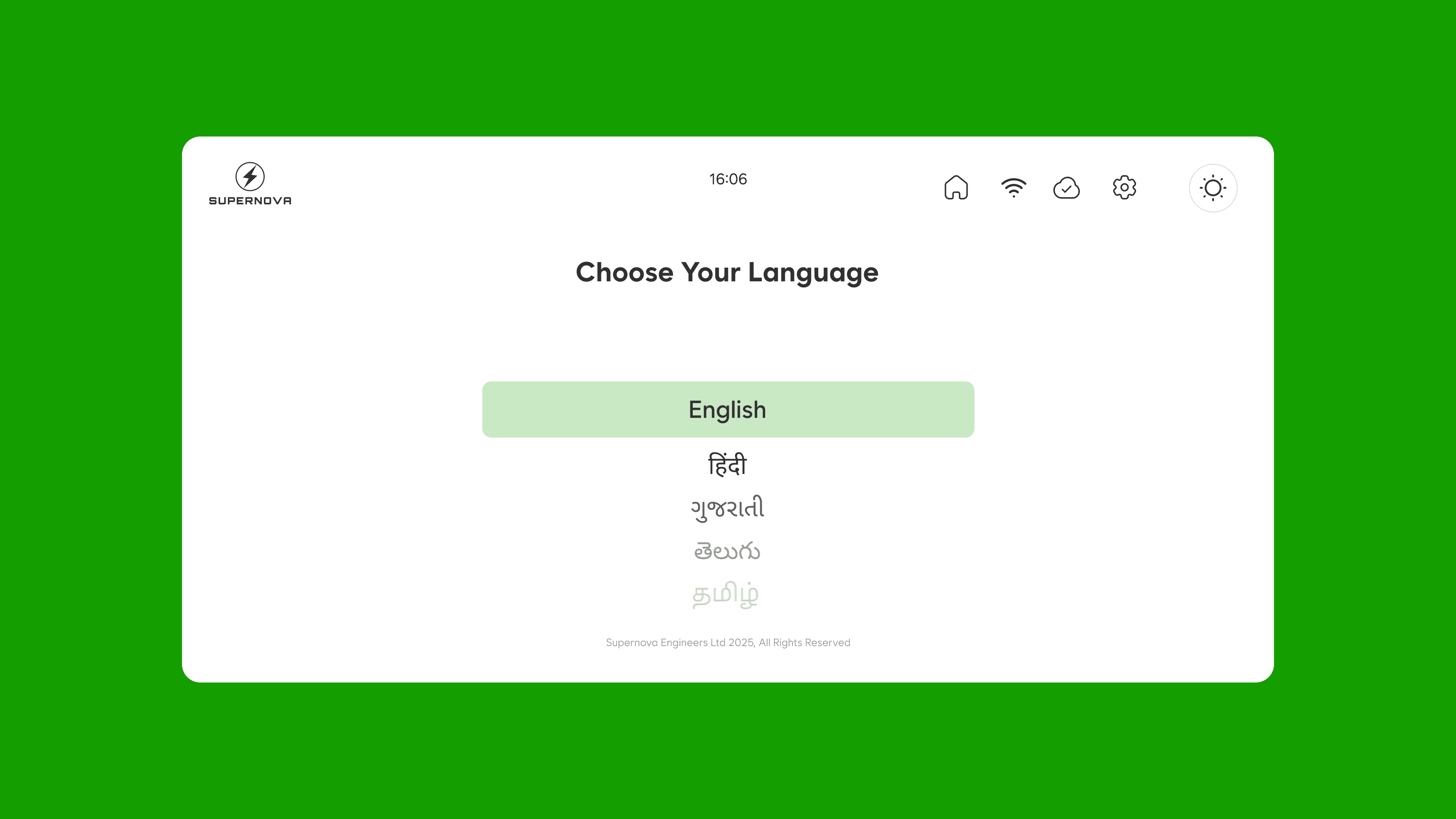
Multi language Support
Lets users switch to their preferred language instantly for a more comfortable charging experience.

Supernova Engineers Ltd 2025, All Rights Reserved
Choose Your Language
English
हिंदी
ગુજરાતી
తెలుగు
தமிழ்
16:06
Multi language Support
Lets users switch to their preferred language instantly for a more comfortable charging experience.
Supernova Engineers Ltd 2025, All Rights Reserved
Choose Your Language
English
हिंदी
ગુજરાતી
తెలుగు
தமிழ்
16:06
Light and dark mode
Automatically adapts the interface to outdoor lighting conditions for better readability.


Light and dark mode
Automatically adapts the interface to outdoor lighting conditions for better readability.
Descriptive charging dial
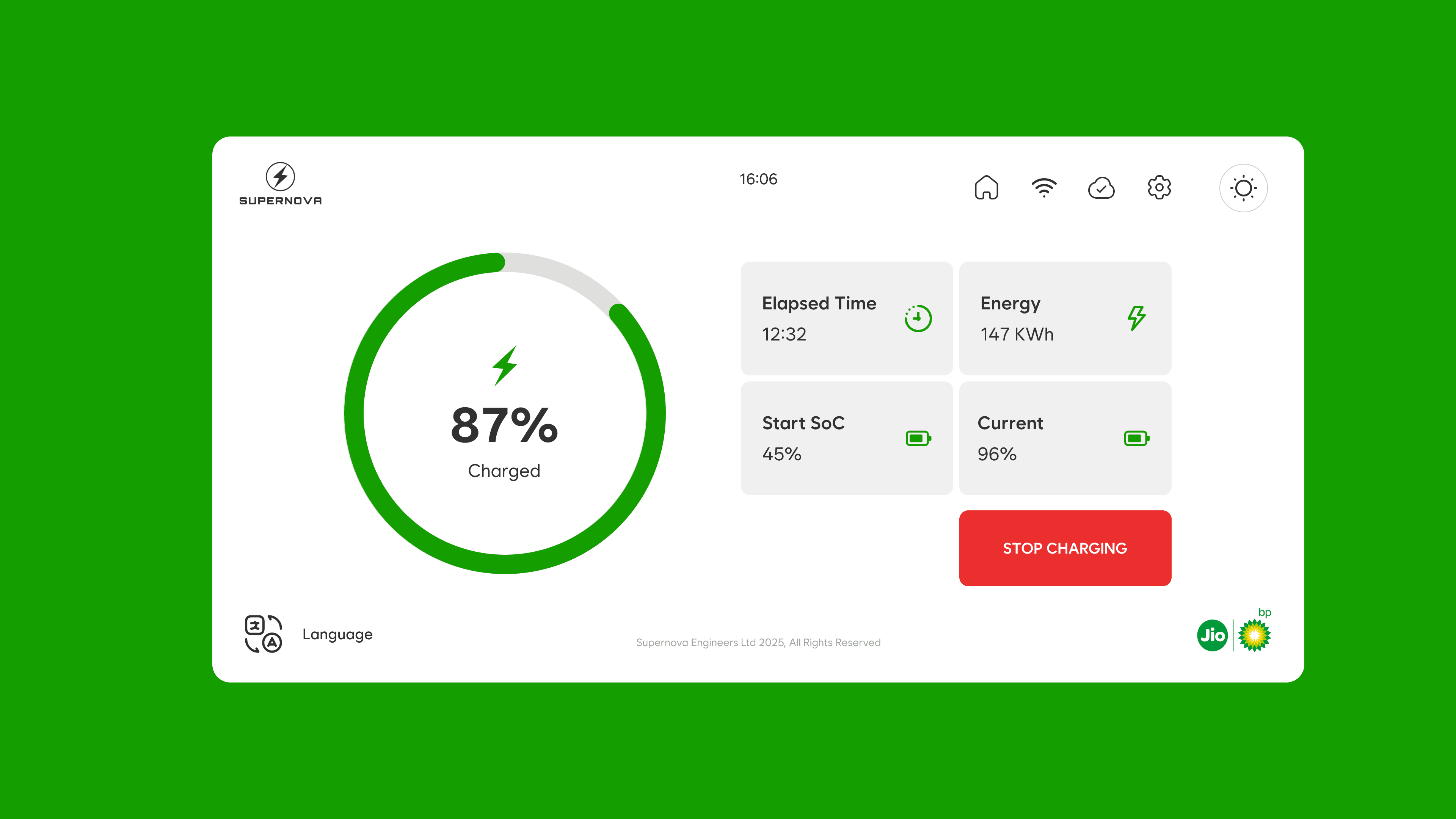
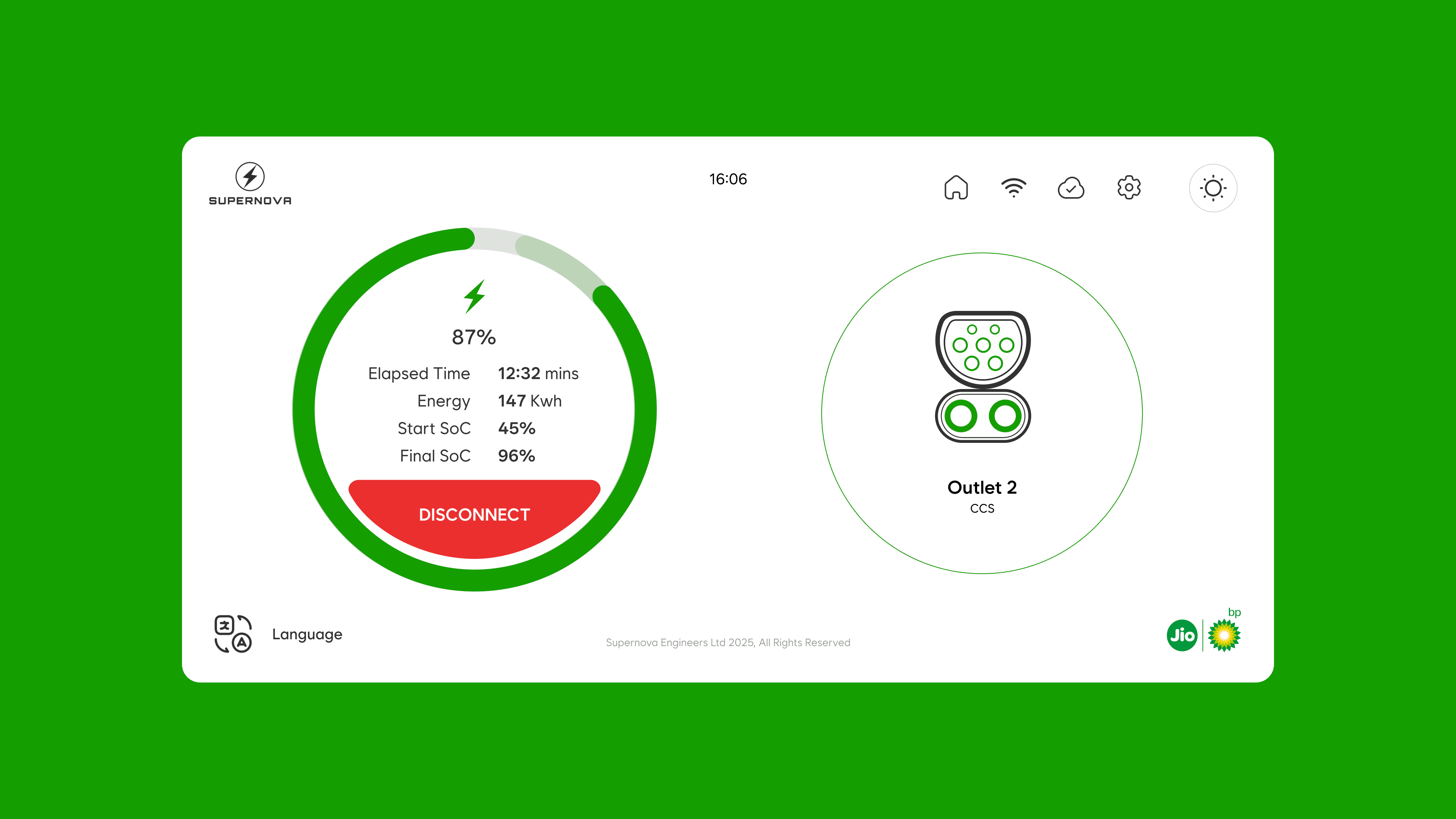
Shows real-time charging progress with clear visuals so users always know what’s happening on the main screen while there are 2 vehicles charging.

Multi language Support
Lets users switch to their preferred language instantly for a more comfortable charging experience.
Supernova Engineers Ltd 2025, All Rights Reserved
Choose Your Language
English
हिंदी
ગુજરાતી
తెలుగు
தமிழ்
16:06
Light and dark mode
Automatically adapts the interface to outdoor lighting conditions for better readability.
Descriptive charging dial
Shows real-time charging progress with clear visuals so users always know what’s happening on the main screen while there are 2 vehicles charging.
THE PROCESS
THE PROCESS
THE PROCESS
Design Components.
Design Components.
Creating design components was one of the curcial steps while designing the interface as the components are something that has to be informative yet visually engaging and clear to the user.
Creating design components was one of the curcial steps while designing the interface as the components are something that has to be informative yet visually engaging and clear to the user.
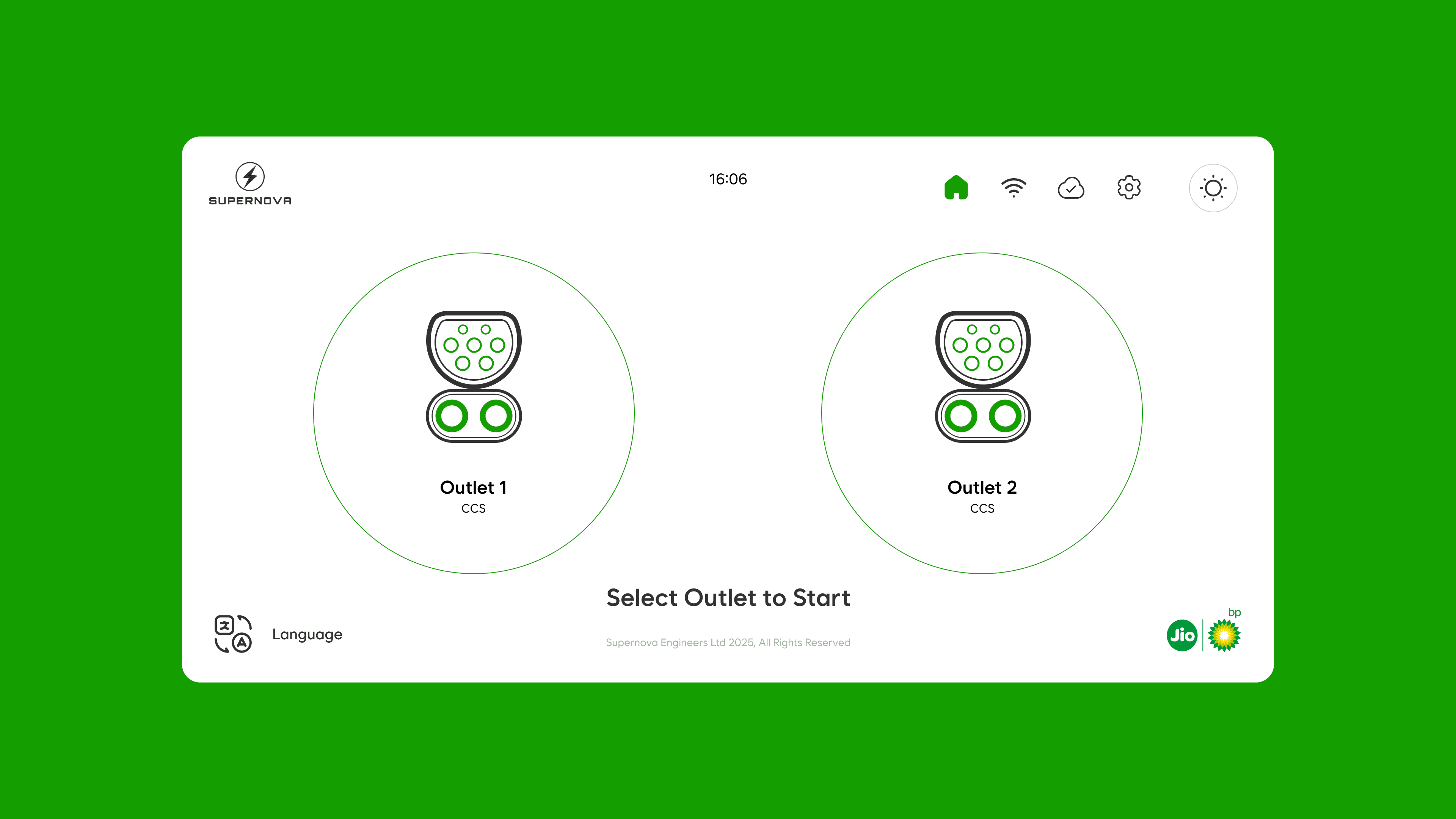
Outlet 1
CCS
87%
Charged
Elapsed Time
12:32
Energy
147 KWh
Start SoC
45%
Final SoC
96%
RFID Tag
Scan QR Code
DISCONNECT
Elapsed Time
Energy
Start SoC
Final SoC
12:32 mins
147 Kwh
45%
96%
87%
STOP CHARGING
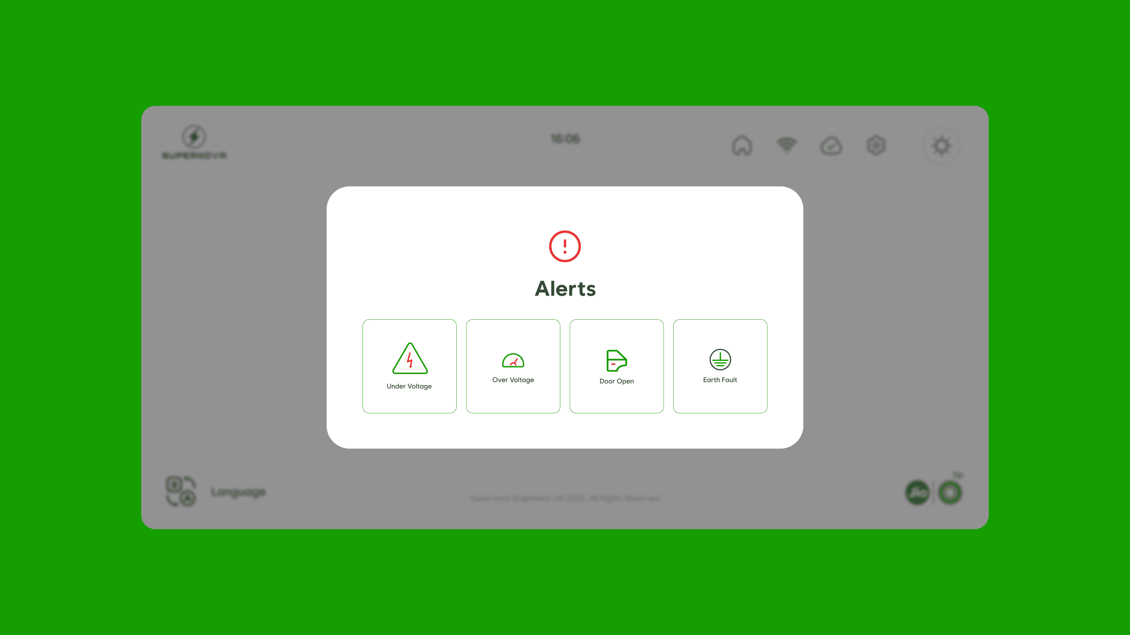
Under Voltage
Over Voltage
Over Voltage
Door Open
Door Open
Earth Fault
Earth Fault
Outlet 1
CCS
87%
Charged
Elapsed Time
12:32
Energy
147 KWh
Start SoC
45%
Final SoC
96%
RFID Tag
Scan QR Code
DISCONNECT
Elapsed Time
Energy
Start SoC
Final SoC
12:32 mins
147 Kwh
45%
96%
87%
STOP CHARGING
Under Voltage
Over Voltage
Door Open
Earth Fault
THE PROCESS
THE PROCESS
Visual Design.
Visual Design.
Once the structural decisions were set, I moved into designing the system to create the screens. I designed a visual identity that matches with the brand.
Once the structural decisions were set, I moved into designing the system to create the screens. I designed a visual identity that matches with the brand.
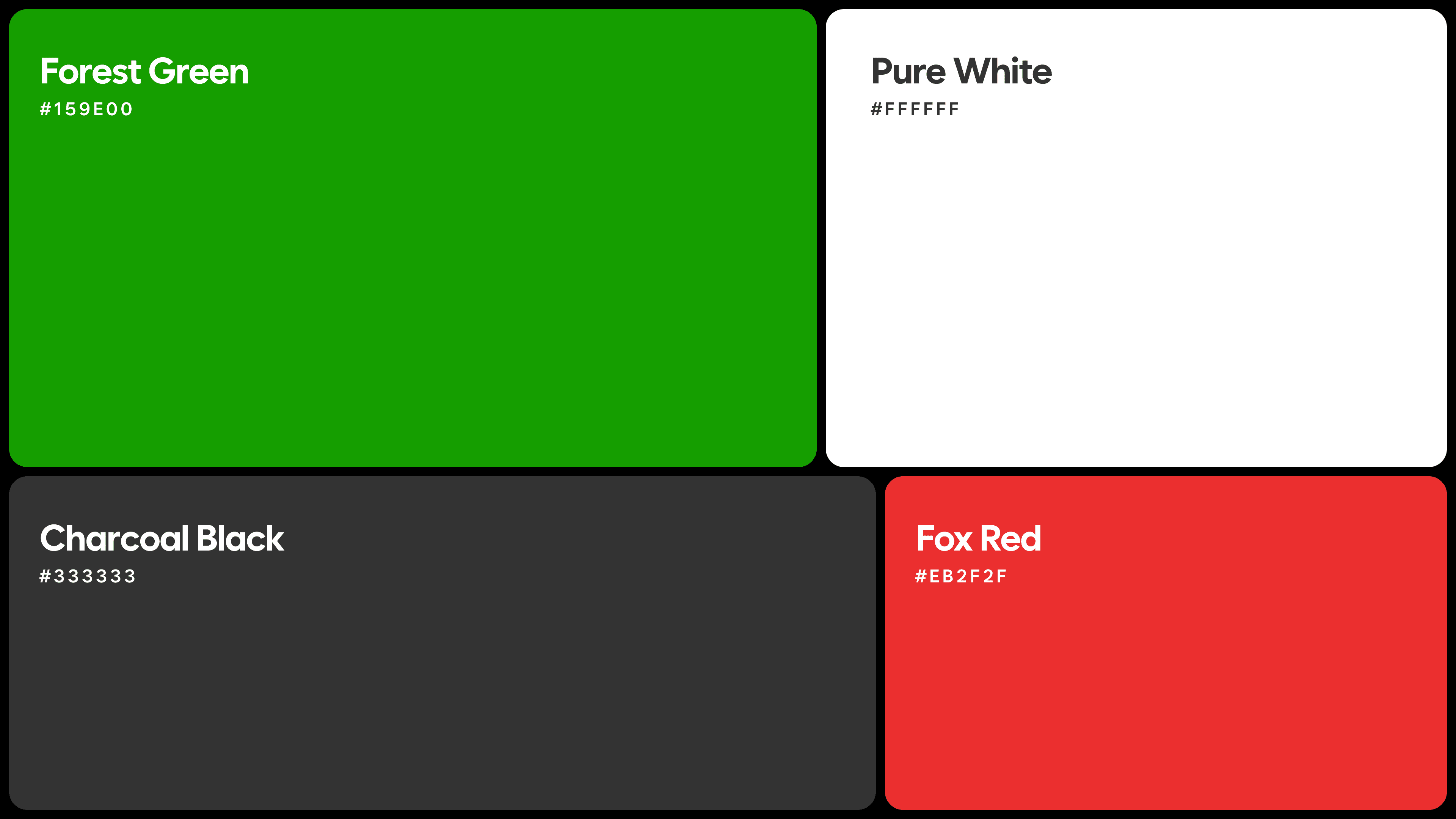
Colors.
Colors.
Colors were chosen on the basis of their current brand identity. They were only using green as their accent color with any other color.
Colors were chosen on the basis of their current brand identity. They were only using green as their accent color with any other color.
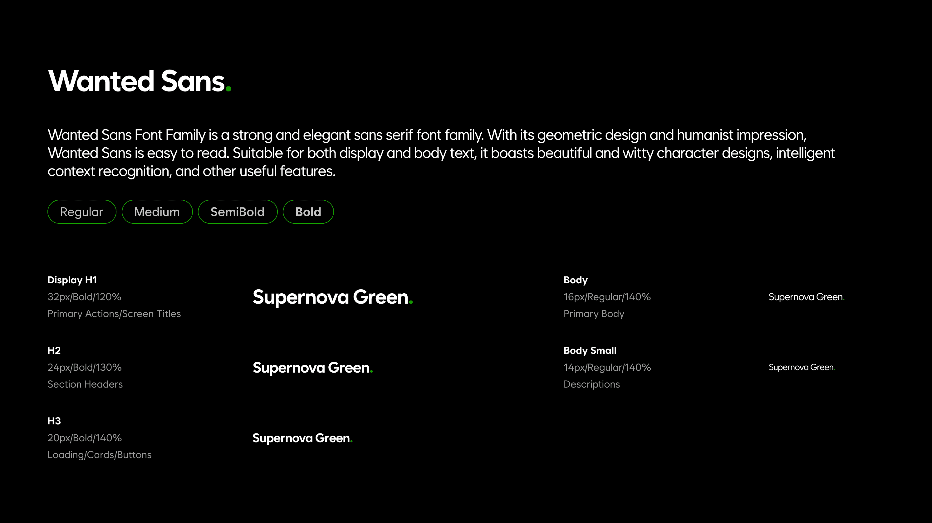
Fonts.
Choosing the right typography was an important step, since it needed to be clear and easy to read. I chose sans serif typefaces because they are well suited for on screen reading.
ONGOING
ONGOING
Future Scope
Future Scope
The redesigned interface forms a solid foundation for Supernova Green’s charging experience, with room to evolve as real users interact with it. As the network grows, the UI can expand to support new capabilities, improved accessibility, and deeper system intelligence. These enhancements will shape the charger into a more seamless, scalable, and user-centered product.
The redesigned interface forms a solid foundation for Supernova Green’s charging experience, with room to evolve as real users interact with it. As the network grows, the UI can expand to support new capabilities, improved accessibility, and deeper system intelligence. These enhancements will shape the charger into a more seamless, scalable, and user-centered product.
User testing and iterative refinement
User testing and iterative refinement
User testing and iterative refinement
Once the product is deployed, structured user testing will help validate the redesigned flow. Insights from real charging behavior will guide the next wave of improvements.
Once the product is deployed, structured user testing will help validate the redesigned flow. Insights from real charging behavior will guide the next wave of improvements.
Quick Help & Support Access
Quick Help & Support Access
Quick Help & Support Access
A built-in help panel can offer instant answers to common questions and connect users to support when needed. This ensures users never feel stuck or uncertain during the charging process.
A built-in help panel can offer instant answers to common questions and connect users to support when needed. This ensures users never feel stuck or uncertain during the charging process.
Error Recovery Assistance
Error Recovery Assistance
Error Recovery Assistance
Future versions can guide users through resolving common issues, like failed handshakes or connector errors. Clear, friendly prompts reduce frustration and increase confidence at the charger.
Future versions can guide users through resolving common issues, like failed handshakes or connector errors. Clear, friendly prompts reduce frustration and increase confidence at the charger.
Technician mode for diagnostics
Technician mode for diagnostics
Technician mode for diagnostics
A dedicated technician interface can streamline error detection and maintenance. Clear diagnostic visuals and guided steps can reduce downtime and service complexity.
A dedicated technician interface can streamline error detection and maintenance. Clear diagnostic visuals and guided steps can reduce downtime and service complexity.
CONCLUSION
CONCLUSION
My Learnings
My Learnings
This project reinforced the importance of designing for context over convention. Working on a public EV charging interface highlighted how assumptions drawn from mobile and web design can fail in high-pressure, shared environments. The process sharpened my focus on clarity, restraint, and system feedback, and emphasized how good infrastructure design is often invisible, felt more through reliability than visual expression.
This project reinforced the importance of designing for context over convention. Working on a public EV charging interface highlighted how assumptions drawn from mobile and web design can fail in high-pressure, shared environments. The process sharpened my focus on clarity, restraint, and system feedback, and emphasized how good infrastructure design is often invisible, felt more through reliability than visual expression.
Small inconsistencies create big confusion.
Small inconsistencies create big confusion.
Small inconsistencies create big confusion.
Icon mismatches, unclear labels, and weak feedback loops seem minor, but they break trust instantly. This project helped me appreciate the weight that every micro-decision in UI carries.
Icon mismatches, unclear labels, and weak feedback loops seem minor, but they break trust instantly. This project helped me appreciate the weight that every micro-decision in UI carries.
Improving an existing system is about clarity.
Improving an existing system is about clarity.
Improving an existing system is about clarity.
This wasn't about building from scratch — it was about untangling what existed, fixing hierarchy, tightening consistency, and making interactions intuitive without disrupting familiar patterns.
This wasn't about building from scratch — it was about untangling what existed, fixing hierarchy, tightening consistency, and making interactions intuitive without disrupting familiar patterns.
Design for context, not convention.
Assumptions from mobile and web design break down fast in public, high-pressure environments. This project sharpened my instinct for reading context first — before reaching for patterns.
Assumptions from mobile and web design break down fast in public, high-pressure environments. This project sharpened my instinct for reading context first — before reaching for patterns.


TABLET VIEW IS STILL UNDER DEVELOPMENT.
Open to Work
Ahmedabad, India
Interaction Designer
Brand Designer