RESEARCH
RESEARCH
RESEARCH
Primary Research.
Primary Research.
Primary Research.
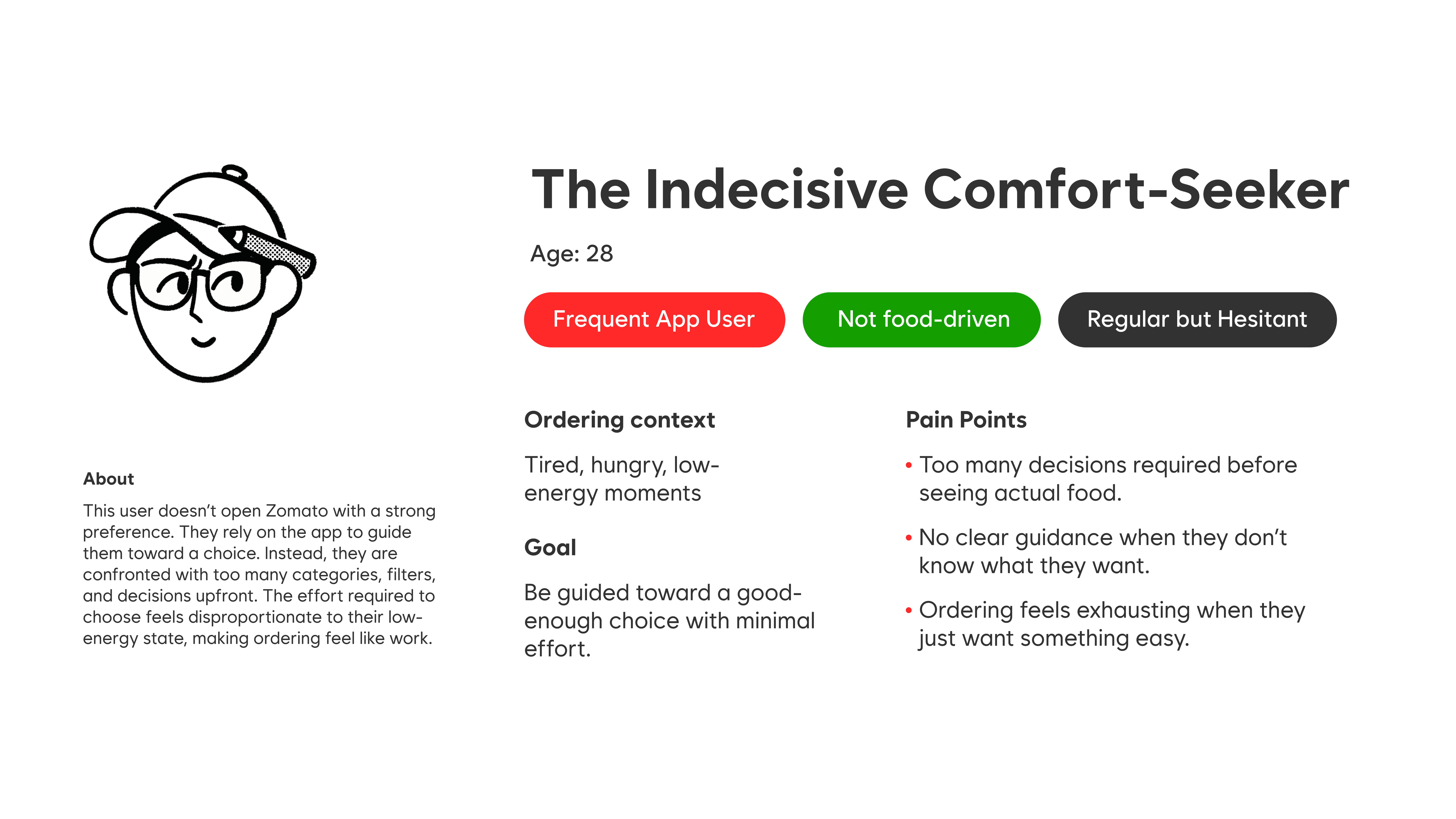
I conducted three informal interviews with frequent Zomato users. All participants identified themselves as food enthusiasts and used the platform regularly. A consistent pattern emerged across all conversations. While users appreciated the sheer variety Zomato offers, they also felt overwhelmed by it. Participants described the ordering process as mentally taxing, especially during the initial phase where they are required to choose between cuisines, restaurants, and dishes all at once.
I conducted three informal interviews with frequent Zomato users. All participants identified themselves as food enthusiasts and used the platform regularly. A consistent pattern emerged across all conversations. While users appreciated the sheer variety Zomato offers, they also felt overwhelmed by it. Participants described the ordering process as mentally taxing, especially during the initial phase where they are required to choose between cuisines, restaurants, and dishes all at once.
I conducted three informal interviews with frequent Zomato users. All participants identified themselves as food enthusiasts and used the platform regularly. A consistent pattern emerged across all conversations. While users appreciated the sheer variety Zomato offers, they also felt overwhelmed by it. Participants described the ordering process as mentally taxing, especially during the initial phase where they are required to choose between cuisines, restaurants, and dishes all at once.